healthy spotlight

Designing a wellness platform focused on engagement and usability

Scope

Product discovery, UX strategy, information architecture, interaction design, mobile experience, implementation collaboration

Healthy Spotlight is a digital wellness platform designed to help users access practical nutrition advice and simple recipes, while enabling a nutrition professional to scale her expertise beyond one-to-one consultations.

I owned the product experience end-to-end , from defining the problem space to shaping the experience architecture and supporting implementation.

/Product Context

Users seeking nutrition guidance often face cluttered content, unclear structure, and overwhelming information. Meanwhile, the business needed a digital product that could:

• establish credibility quickly
• encourage repeat engagement
• support real-world mobile usage
• scale content over time 

The challenge was to design an experience that balanced authority with simplicity while fitting naturally into users’ daily routines , especially during cooking.

/Discovery & Research

  • I began by understanding user behaviour and content consumption patterns. <br>

    Research included:

    • user conversations to identify motivations and frustrations
    • competitive analysis of existing wellness platforms
    • content audits to evaluate structure and hierarchy

    Key insights: 

    • most recipe browsing happens on mobile
    • users prefer scannable, step-by-step guidance over dense layouts
    • trust signals must appear early in the journey

    From this, I defined two core product hypotheses:

    1. If recipes are optimized for mobile task flows, usability and engagement will improve.

    2. If credibility is surfaced early, users will trust the platform faster and return more often.

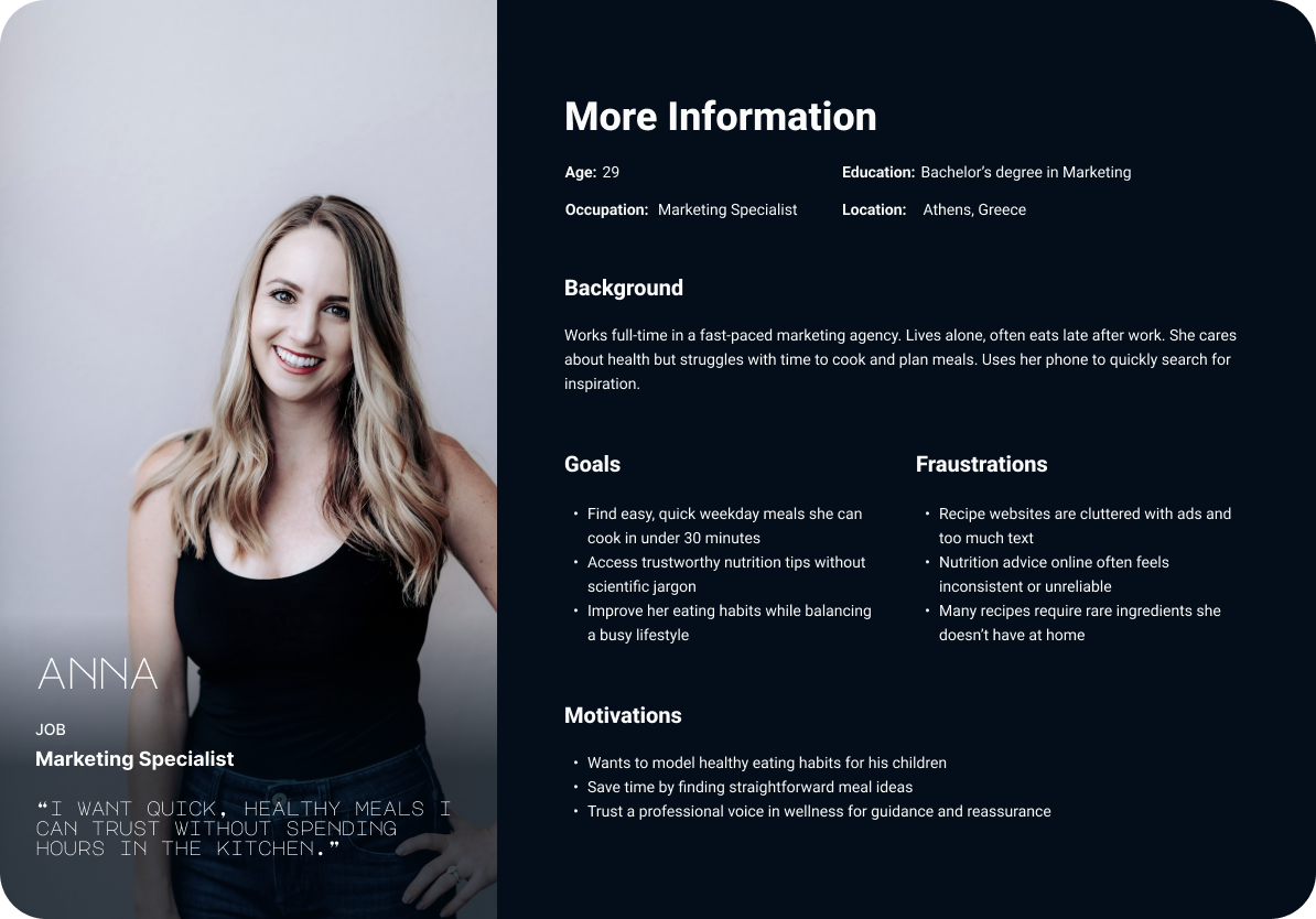
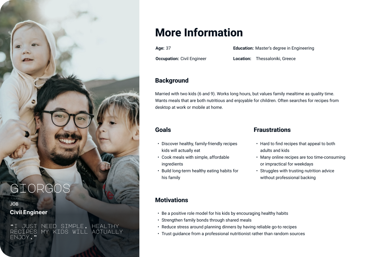
USER PERSONAs

Two primary personas were created to represent distinct user needs and behaviors. These personas guided prioritization of mobile-first flows and informed decisions around content hierarchy and trust placement.

Strategy & Experience Definition

/Trust First

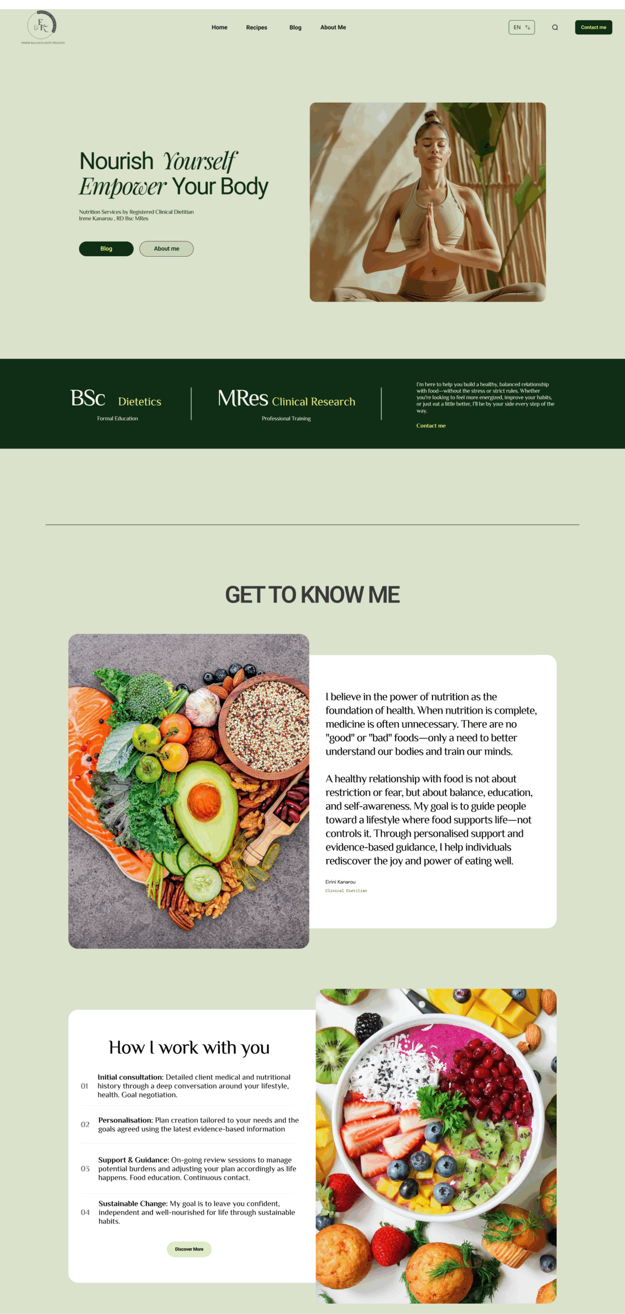
I elevated the founder’s introduction and credentials within the information hierarchy to establish credibility before users explored content.

/Task-Oriented Mobile Design

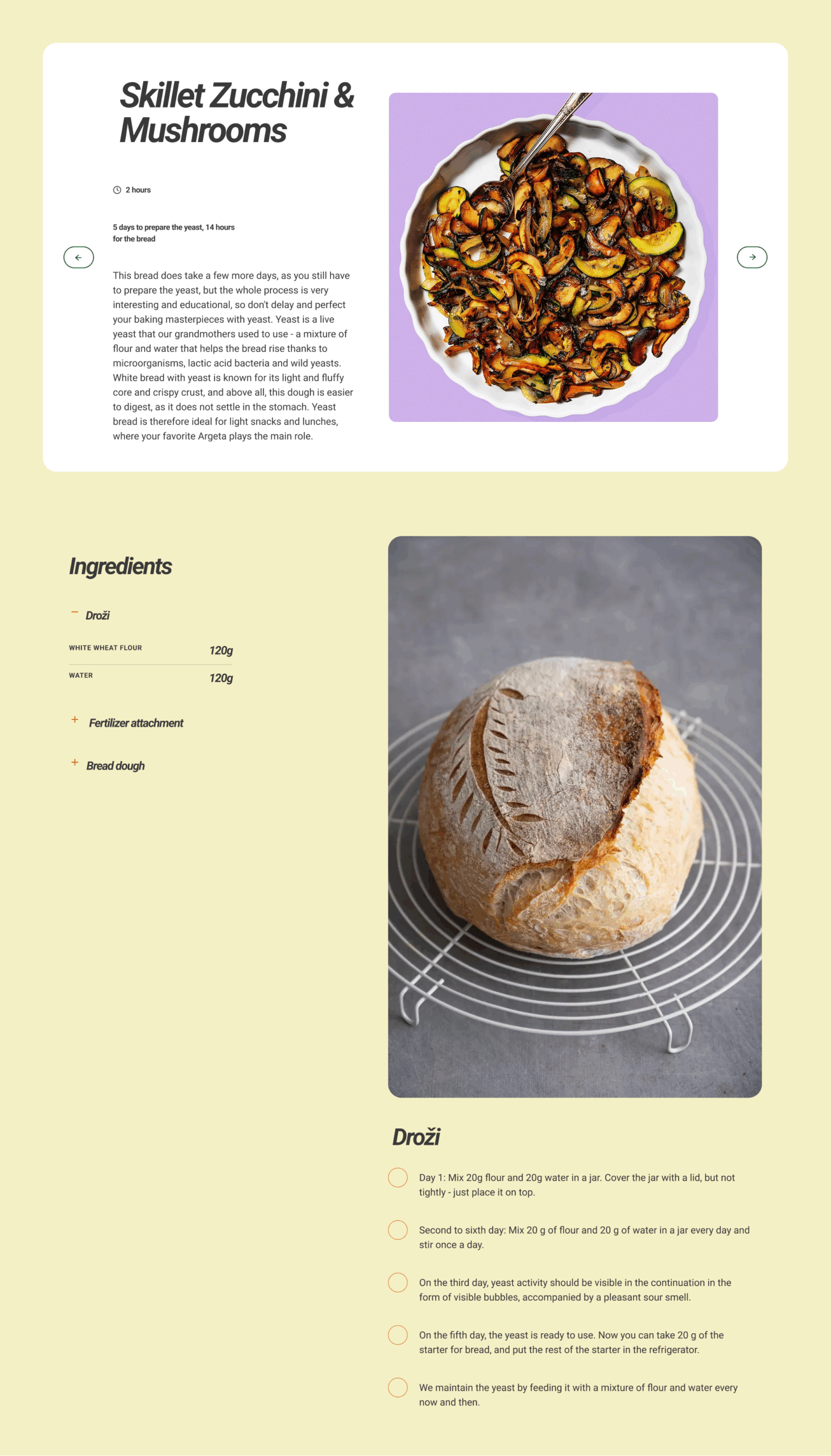
  • Recipes were restructured into a clear sequential flow:

    Ingredients → Preparation → Steps

    This supported real-life cooking scenarios and reduced cognitive load.

/Long-Term Engagement

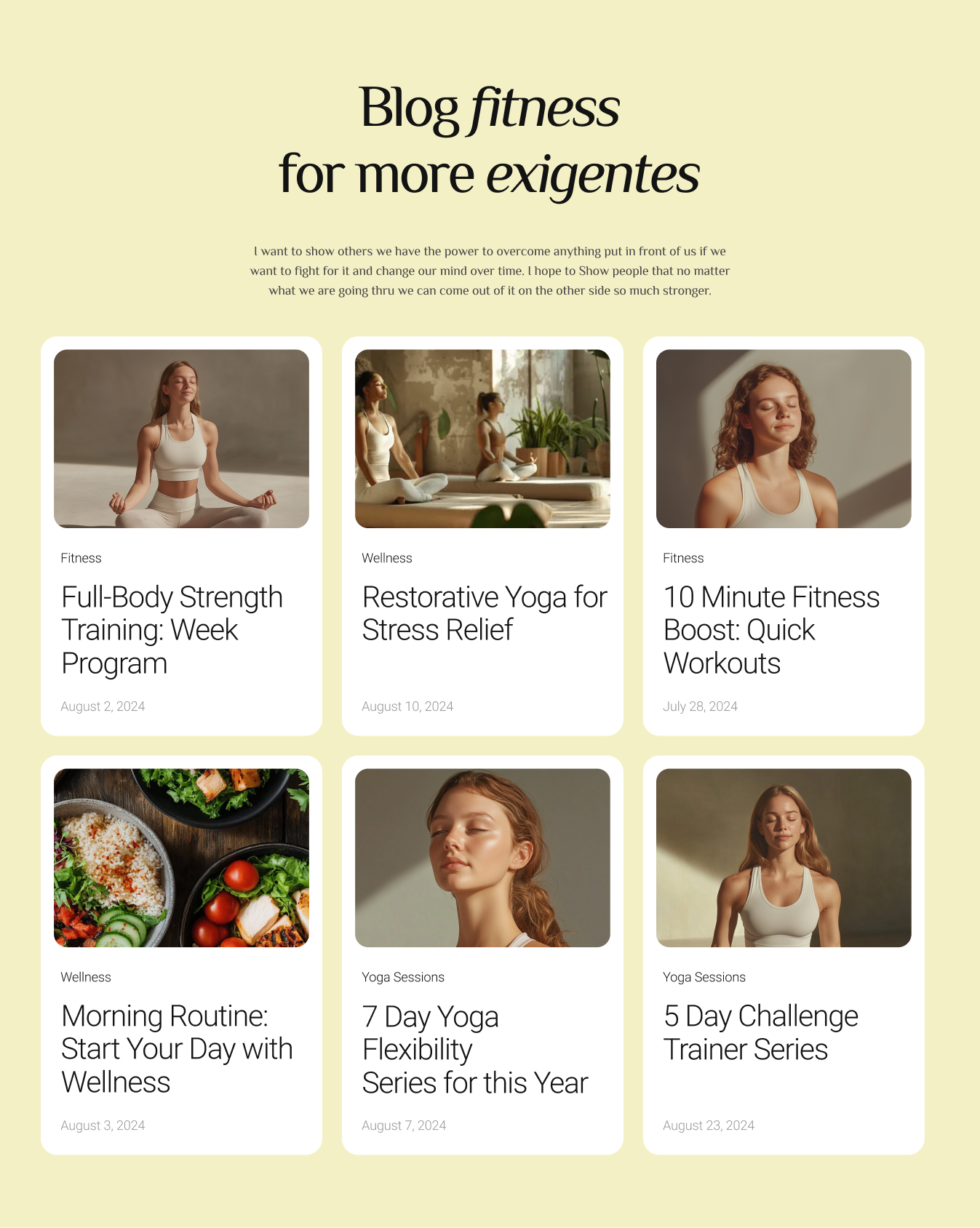
A blog section was introduced to extend value beyond recipes and encourage ongoing interaction with wellness content.

User flow mapping

Mapping the end-to-end journey helped identify friction points and simplify the primary interaction loop. This clarified where users hesitated and allowed unnecessary steps to be removed.

Design Decisions

To maintain clarity in the initial release, I intentionally deferred advanced functionality such as search and saved recipes.

The focus was on validating core behaviors before expanding product scope.

This prioritization ensured the experience remained simple while reducing early delivery risk.

Solution

The final product delivered:

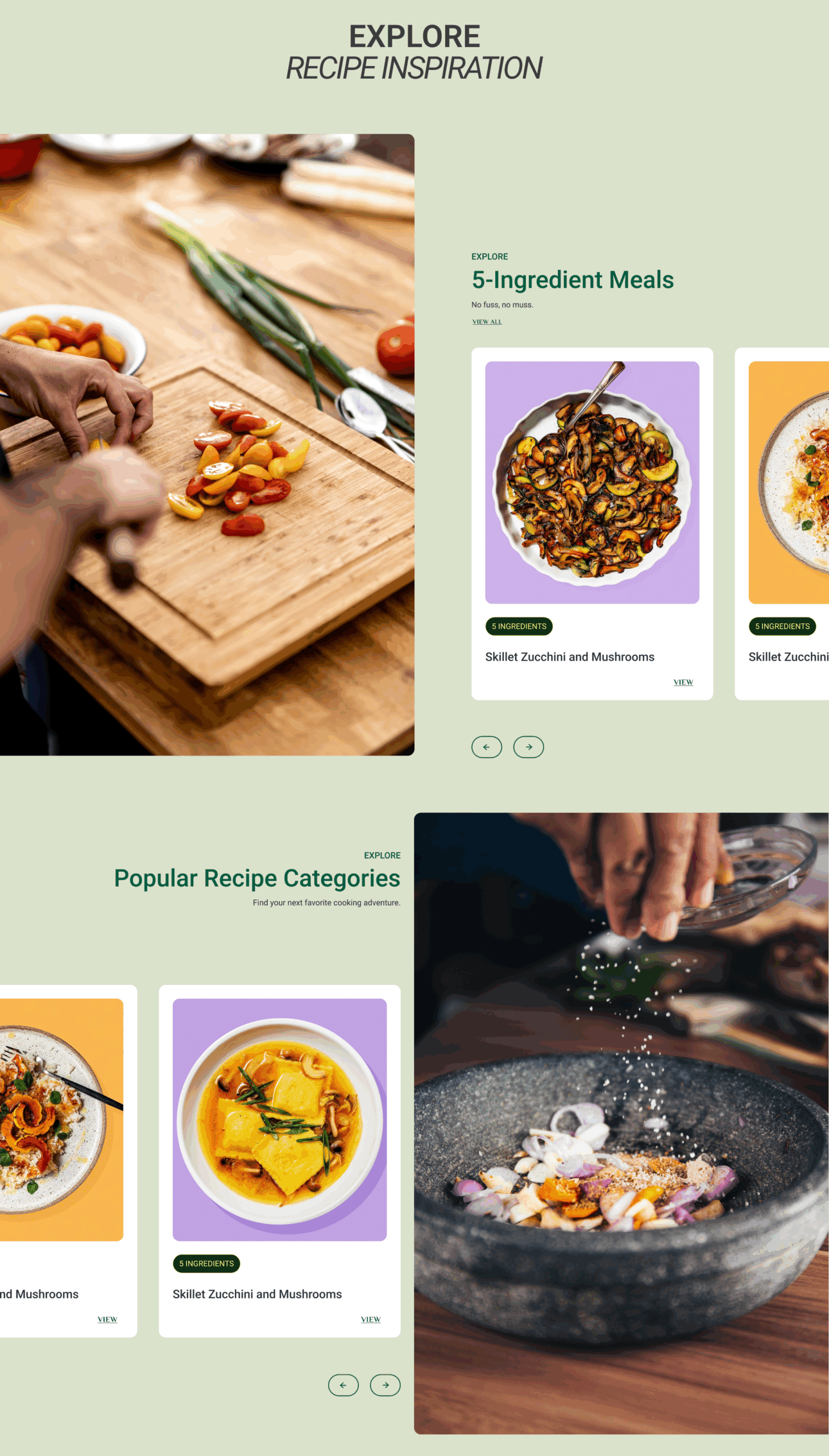
• a mobile-first recipe experience optimized for real usage
• clear content hierarchy with predictable interaction patterns
• strong personal branding to reinforce trust
• a blog system to support deeper engagement

The design system emphasized consistency, readability, and scalability as content grows.

Key Screens

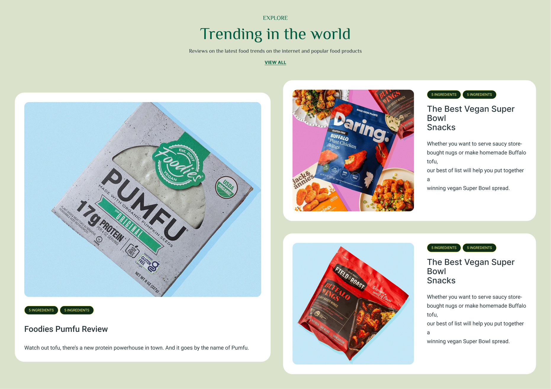
Screens were designed to support task completion first, with visual elements reinforcing clarity rather than competing for attention.

/Outcomes

Post-launch feedback indicated:

• Users found recipes easier to follow
• Navigation felt clearer compared to similar platforms
• The founder’s credibility was more visible and better communicated

While early releases focused on qualitative validation, these results confirmed the primary usability and trust hypotheses.

Future iterations can build on this foundation with behavioral analytics and engagement metrics

/Reflection

This project reinforced the importance of designing for behavioral context rather than visual trends. Simplicity, when grounded in research, consistently outperforms feature-heavy experiences.

It also strengthened my approach to hypothesis-driven design and intentional scope definition before expanding functionality.

/What I’d Do Next

Given more time and data, next steps would include:

• Analytics integration to measure engagement and drop-off
• Search and content filtering
• Personalized recipe recommendations
• Saved recipes and user accounts

Each feature would be validated against observed behavior before implementation.